BRANDING DESIGN
We provide a free day to experience our benefits of digital world
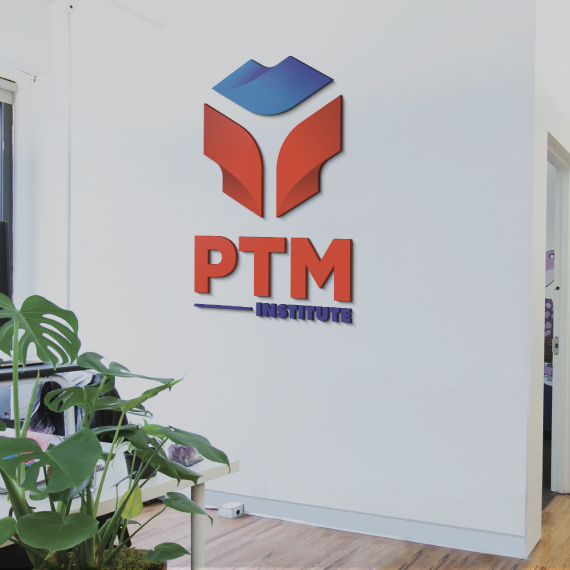
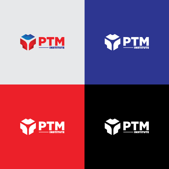
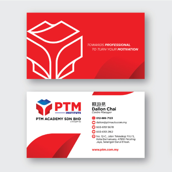
PTM INSTITUTE'S BRANDING DESIGN
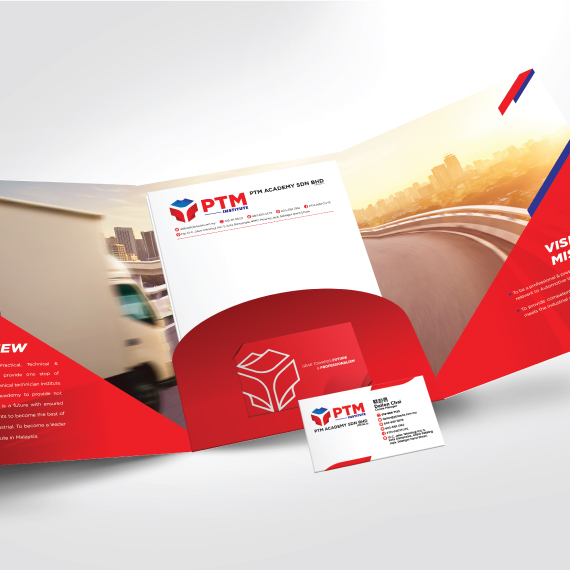
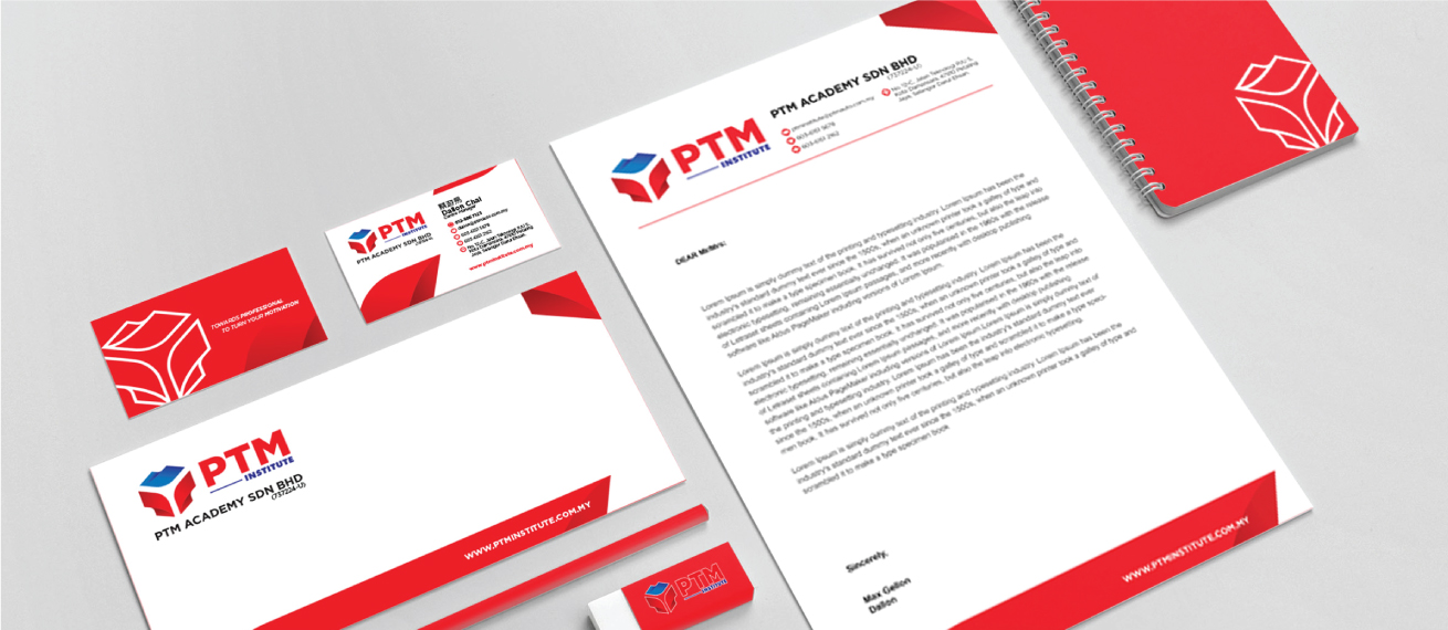
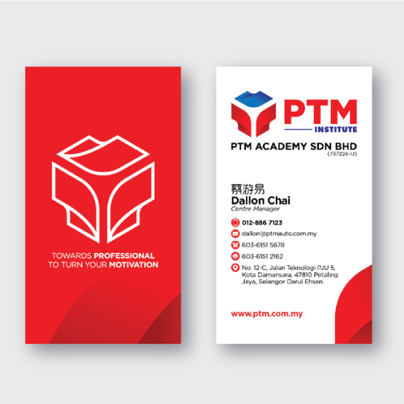
Coporate Identity System
-
Industry:
Institute
-
Client Name:
PTM Institute
-
Created By:
SignCotive Team
Project Details:
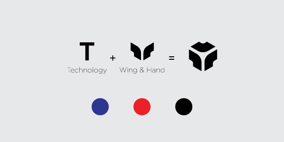
We designed the logo with a strong "T" shape, which stands for "Technology," a core focus of the PTM Institute. The "T" is subtly incorporated into the overall design, reflecting the institute's commitment to technological advancement.
The PTM Institute logo features a distinctive red shape that represents both wings and hands. The wings symbolize growth, freedom, and the institute's commitment to helping students reach new heights in their educational and professional journeys.
The hands, on the other hand, convey support, guidance, and the nurturing environment that PTM Institute offers. The red color is powerful and dynamic, symbolizing energy, passion, and action, which aligns with the institute's proactive approach to education.
Complementing the red is the blue color at the top of the logo, which suggests stability, trust, and confidence. These are essential qualities in both education and technology.
The combination of red and blue creates a harmonious balance, reflecting PTM Institute's mission to inspire and support students while fostering a strong foundation in technology.
Through our branding design, we aimed to communicate a sense of community, creativity, and enjoyment, presenting the café as a place where people can come together to relax, play games, and enjoy good coffee.
Point of Purchase (POP)

Through our branding design, we aimed to communicate a sense of innovation, collaboration, and growth, presenting the institute as a place where students and professionals can come together to learn, share ideas, and advance in their careers. Our design emphasizes the institute's commitment to fostering a supportive and dynamic environment where education and technology intersect to create opportunities for success.