GRAPHIC DESIGN
We provide a free day to experience our benefits of digital world
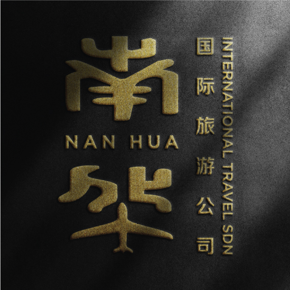
NAN HUA INTERNATIONAL TRAVEL SPN'S BRANDING DESIGN
-
Industry:
Travel Agency
-
Client Name:
Nan Hua
-
Created By:
SignCotive Team
Project Details:
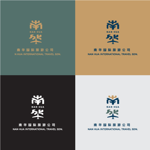
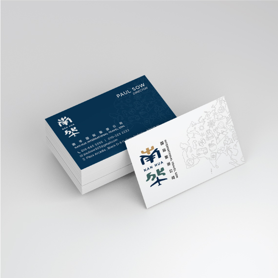
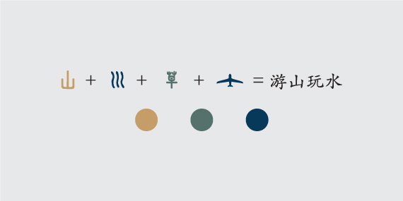
We designed the branding for an international travel agency with a focus on encapsulating the agency’s mission and identity in a visually compelling way. The logo features stylized Chinese characters that merge tradition with modernity, reflecting the agency’s cultural roots and symbolizing trust and a deep connection with the regions it serves.
The color scheme plays a crucial role in conveying the agency’s values. Dominated by navy blue, the logo exudes reliability and professionalism while also evoking the vastness of the sky and sea, key elements in travel.
Light brown accents add warmth and approachability, making the agency feel welcoming and accessible, while also hinting at the earthy tones of diverse landscapes. The greenish-grey used in the lower section symbolizes nature, tranquility, and the calmness associated with a well-planned journey.
A significant element of the logo is the subtle incorporation of an airplane within the lower part of the design, a universal symbol of travel that underscores the agency’s focus on air travel and global connectivity.
Overall, our branding design aims to position the travel agency as a bridge between cultures, combining tradition with modernity. The carefully chosen colors and shapes represent the agency’s reliability, warmth, and connection to the natural and cultural wonders of the world. Through this design, we communicate the agency’s dedication to offering a trusted and enriching travel experience for its clients.